Smartoys
The brand is a chain of 15 stores located in Brussels and Wallonia - in Belgium. They specialize in the distribution of cultural products, video games, movies, action figures, and card games.
For its 20th anniversary, the brand wanted to refresh its logo to make it more current and coherent with its target audience. For the logo, we were inspired from Japanese style, which is where video games originated, as well as pop culture and game console design.
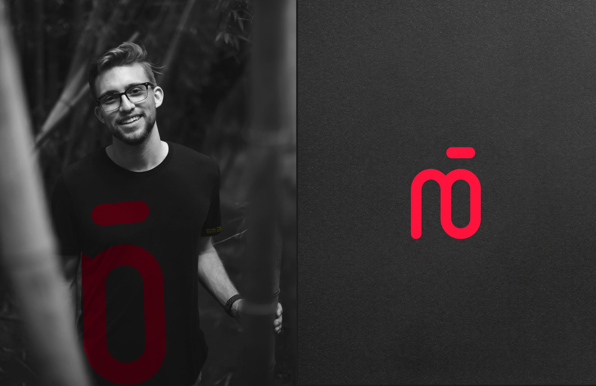
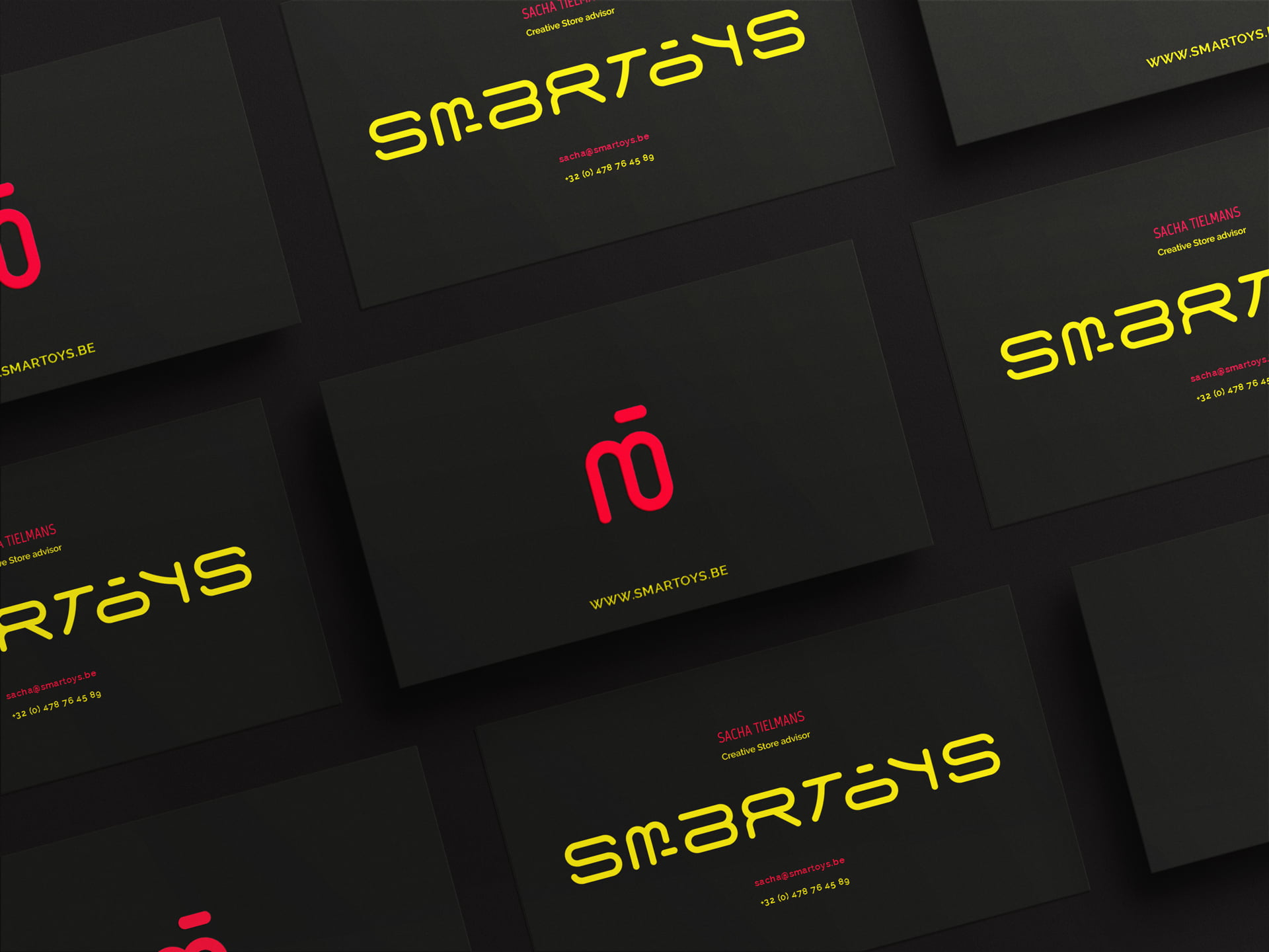
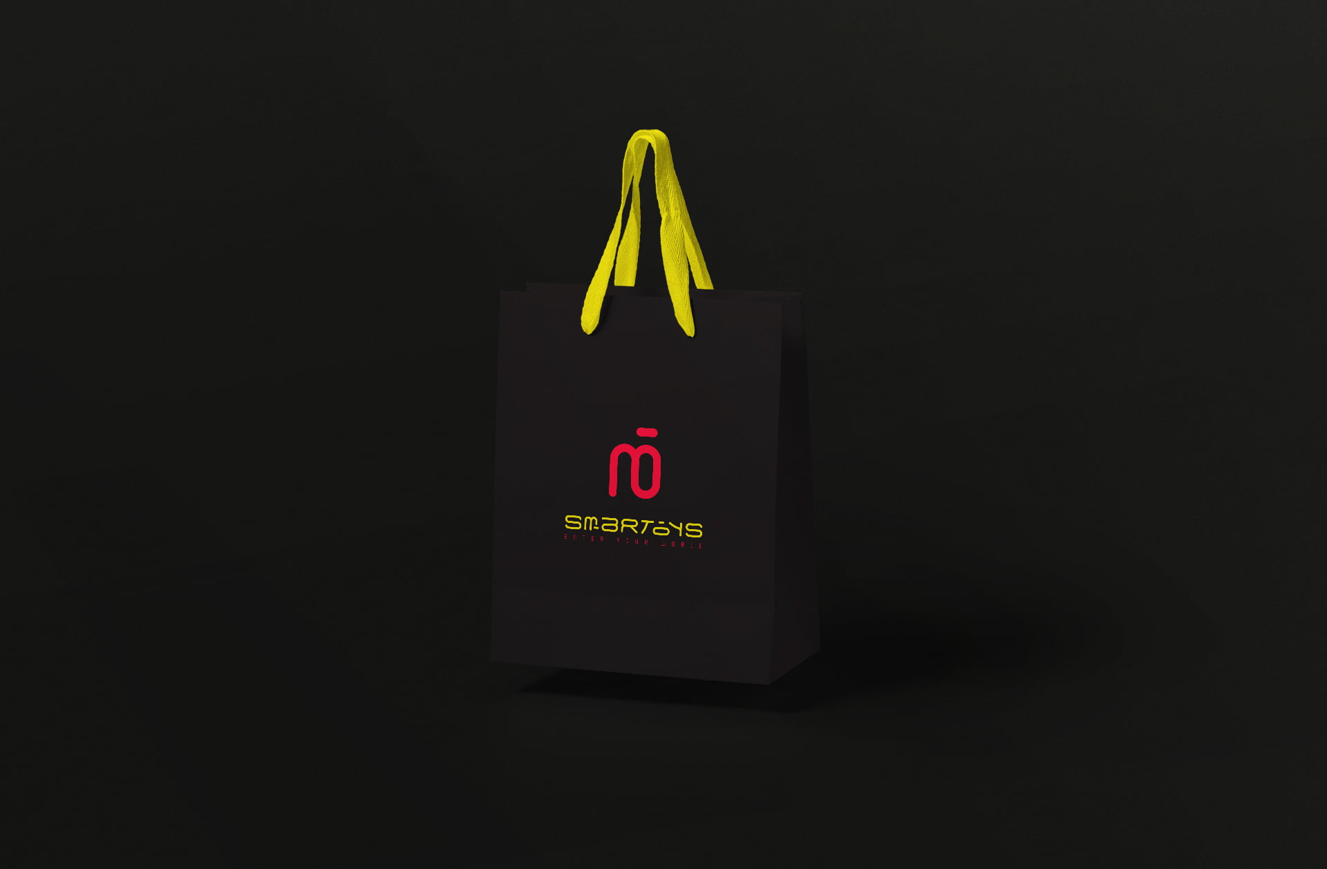
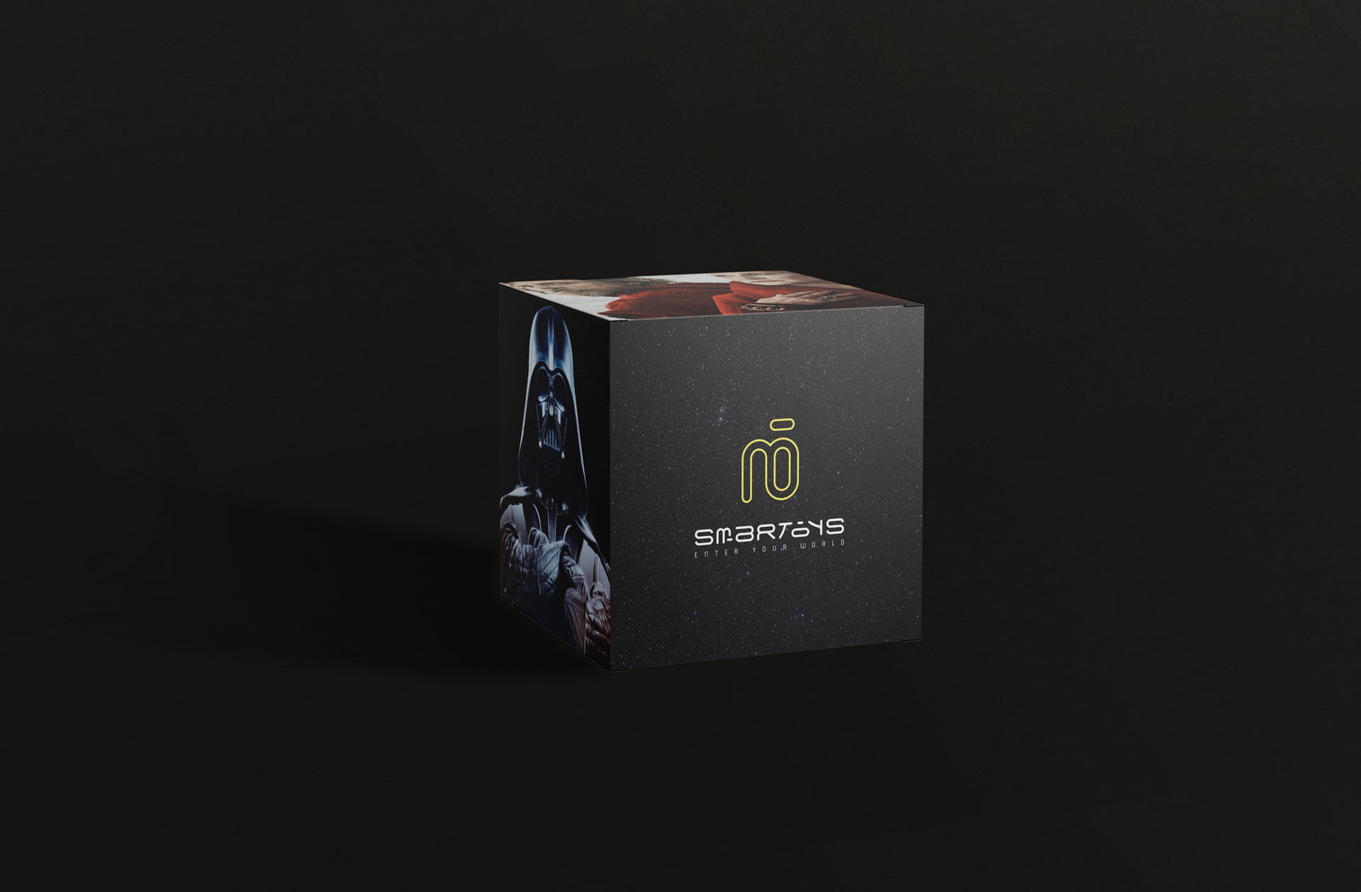
Each letter in the SMARTOYS, name was custom-drawn, partially taking inspiration from the OCULUSeffigy to remind people of its connection to the gaming world. The logo symbol itself originates from the fusion of the letters M and O in SMARTOYS. The color black, which is often seen in technological products, is paired with a PACMAN yellow and POWERSUIT red, a nod to the NINTENDO brand.